Journal
The stories behind my photography
let's talk about strobes
June 15, 2024
I know, I have been absent for a while but for quite some time I felt like talking about strobes, so let’s get to it.
Here is a little bit of everything about strobe lights, also known as strobes or in photographic slang, flash… a popular fancy tool used mostly by professional photographers to create bright and dramatic images.
What is the purpose of a strobe light? Why is it used, and do you actually need it?
The answer is you don’t, and you can create an image simply with the available light that surrounds you. It is more like a personal preference but certainly, it becomes helpful in many situations. My personal style is about creating images that look natural by utilizing ambient light. And yet, I use strobes mostly in every photo shoot, whether it is architectural, lifestyle, or food.
Here are some key points about why I use strobe lights:
- Control over light: Strobe lights provide a powerful and controllable light source, similar to sunlight. This allows photographers to achieve effects that would be difficult or impossible with natural light alone.
- Enhanced colors: Strobe lights can be used to make colors pop, more vivid, and saturated.
- Color correction: In situations with multiple light sources, like warm indoor lighting and cool window light, strobe lights can be used to create a consistent color temperature throughout the image. This eliminates the unwanted color casts that can occur when mixing different light sources.
- Shadow control: Strobe lights can be used to brighten up shadows or create harsh shadows, depending on the desired effect.
- Mimicking sunlight: Strobe lights can be used to mimic sunlight in a dark environment, particularly helpful in highlighting texture.
If the strobes can fix so many issues, why not make the entire image with just artificial lights? While strobes offer creative control, using them alone can result in an image that feels artificial and lacks the natural depth and richness of light found in the real world. Strobes can flatten the scene, making it difficult to be perceived as 3D space and thus, unrealistic. As I would say, it’s flashy.
Relying solely on strobe lights can create a dramatic, but potentially unrealistic effect. Here’s why:
- Unnatural shadows: Natural light creates soft, diffused shadows that gradually fade. Strobes, on the other hand, cast harsher, more defined shadows. While this can be effective for certain creative styles, it can look out of place in situations where softer shadows are expected, like a portrait.
- Color cast: Ambient light plays a role in color temperature. Using only strobes eliminates the subtle color variations introduced by natural light sources like windows or warm indoor lighting. This can result in a flat, one-dimensional color cast throughout the image.
- Lack of depth perception: Natural light provides depth cues through variations in brightness. Strobes, with their uniform illumination, can flatten the scene, making it difficult for the viewer to perceive the 3D space.
Ok, so then how to use strobe lights effectively? Here are some techniques that will help you during the shoot to achieve a natural look:
- Diffusers, umbrellas and softboxes: Attaching diffusers or softboxes to your strobe helps spread the light out over a larger area, creating softer shadows and a more flattering effect. This mimics the diffused light you get from natural sources like windows or cloudy skies.
- Positioning the strobe: The placement of your strobe light has a big impact on how noticeable it is. Experiment with bouncing the light off walls or ceilings, which creates a more indirect and natural-looking illumination. You can also position the strobe off-camera to avoid harsh shadows directly on your subject.
- Power control: Adjusting the power of your strobe light allows you to fine-tune its contribution to the overall scene. By using the strobe as a fill light rather than the main light source, you can subtly enhance the existing light without creating an unnatural look.
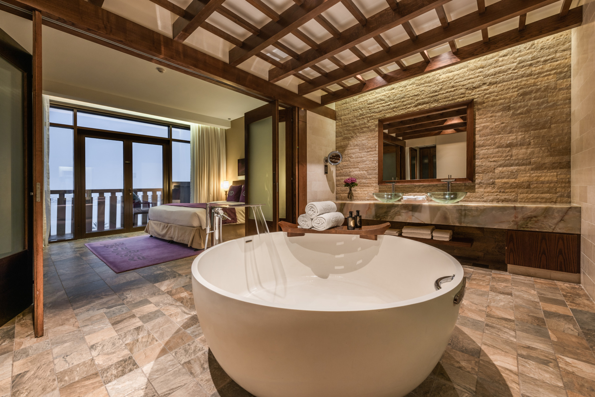
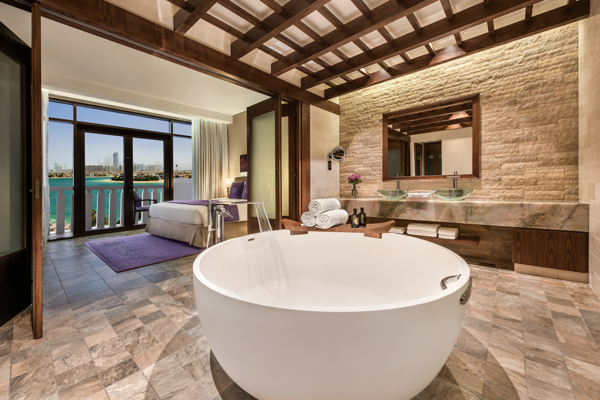
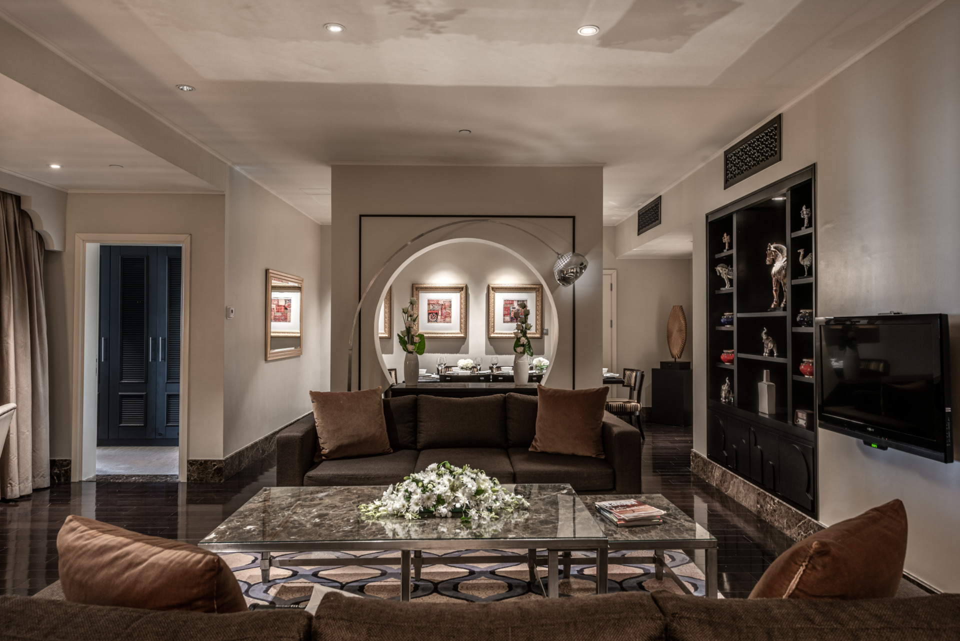
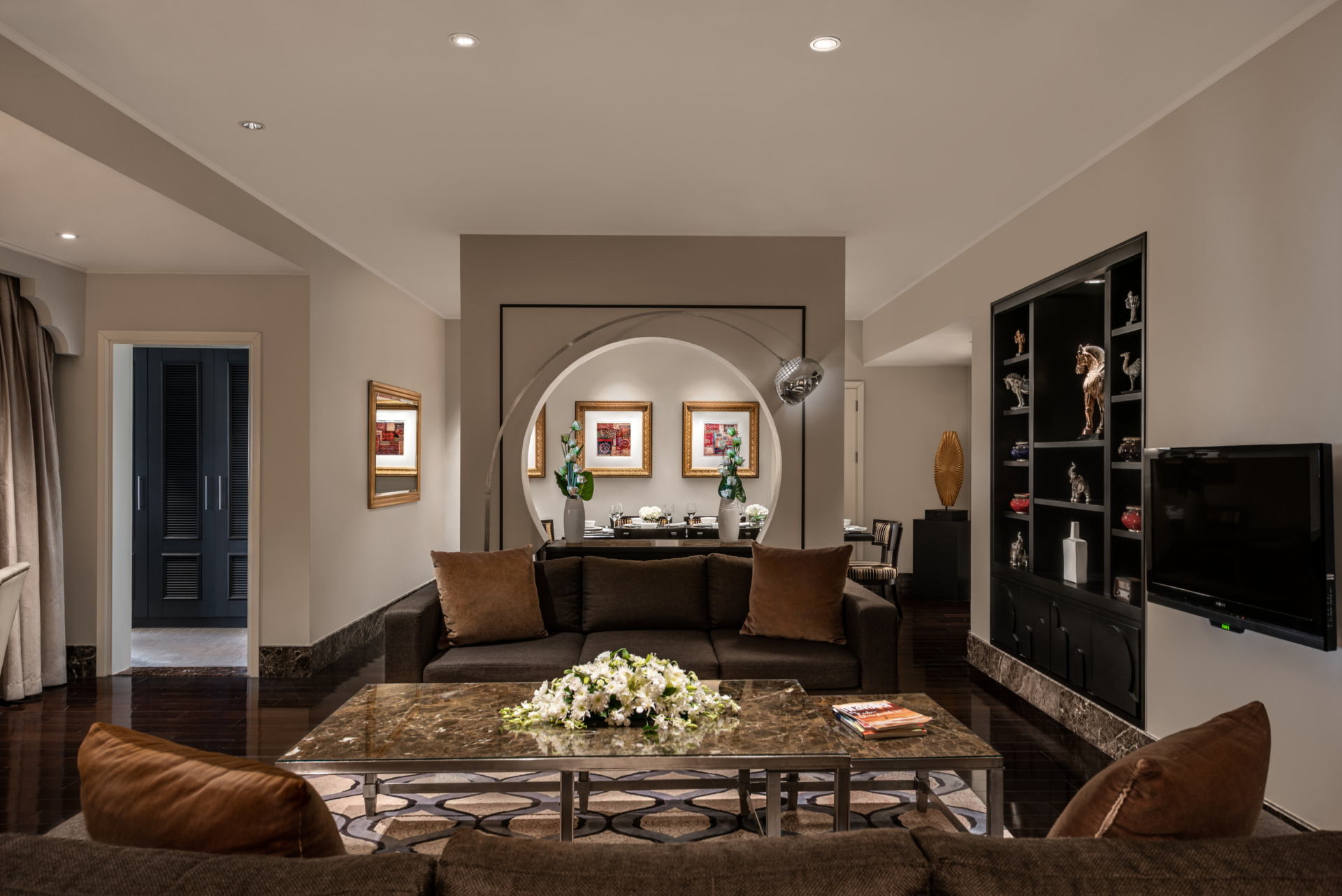
Overall, strobe lights are a versatile tool that can be used by photographers to create a wide range of effects. While they offer fantastic control during a photoshoot, achieving a natural look in post-processing requires a keen eye and technical skills. The key to using strobe lights effectively is to make them appear seamless with the existing light. It takes a lot of practice and knowledge to master the “perfect blending”. It is a process that starts with analyzing the images taken with and without the flash and making all the necessary adjustments and masking to ensure they blend seamlessly. It may sound complicated but it’s worth it. Check out the Before and After below and for more samples, visit How we work page.
Until the next time, stay inspired and keep creating.
Ioanna
benefits from Hotels and Resorts Photography
February 12, 2023
Recently I was thinking about the value of the hospitality photography and its purpose. Of course, nothing makes me more happy and proud than helping our clients, the marketing teams from beautiful hotels and resorts to be specific.
So I decided to touch base on how photography would benefit hotels and resorts? Here are several ways:
- Increased engagement and bookings
Stunning, visually appealing images are crucial for attracting potential guests and standing out in a crowded market. By showcasing the unique character and beauty of a property, professional photography can help draw in new customers and boost occupancy rates.
- Improved marketing and branding
Great photography can be a powerful tool for marketing and branding, helping to communicate a hotel or resort’s unique identity and brand story. These images can be used across a variety of marketing channels, print and digitally, from social media to websites and brochures, to create a cohesive and compelling brand presence.
- Differentiation from competitors
With so many hotels and resorts competing for customers, it’s essential to stand out from the crowd. Appealing photography can help differentiate a property from its competitors, highlighting its unique features and creating a sense of exclusivity and luxury.
- Enhanced guest experience
When guests arrive at a hotel / resort, they want to feel like they’re in a special and welcoming place. Awesome photographs can help create a warm and inviting atmosphere, making guests feel comfortable and excited to explore the property and utilise the services offered.
- Increased revenue
By improving bookings and differentiating a property from competitors, great photography can ultimately lead to increased revenue for a hotel or resort. In addition, by creating a strong brand presence and positive guest experiences, photography helps build a loyal customer base and drive repeat business.
To sum up, hotels and resorts can benefit greatly from professional high-quality photography, helping them attract guests, differentiate from competitors, and ultimately drive revenue and growth.
High-end professional photography is key, being highlighted a couple of times above. What or who stands behind it? If you think, the artist / creator of the work, you are right. And there are so many out there, so being competitive does not only apply to the hotels and resorts but to the photographers too. Will continue this later.
Until then, stay inspired and keep creating.
Ioanna
Bringing life into the otherwise slightly boring scene
February 8, 2023
Nowadays, models are part of the photoshoot sessions. But not always. So what can you do to make the image look livelier? Well, as this is from my personal experience I will share what I usually do when it comes to still lifestyle.
Should the subject is an interior, I like to carry some props. Some brands have a list of recommendations and more or less they are applicable to any shoot.
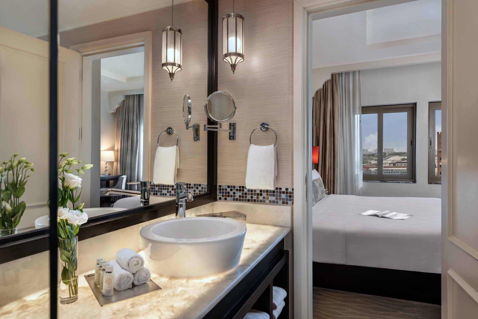
- Flowers emphasise our connection with nature and living thing, they just open up the space. Positioned in lobbies, public areas, rooms, bathrooms and even restaurants and cafes. Normally flowers and vases are in brighter tones and vase type would depend on the flower / bouquet. Whatever it is, flowers should not be distracting but complementing and not too many. Typically, I would place not more than 2 in a room. Large plants are also great additions to lobby, balcony and restaurants. If palm trees are nearby the beach or pool area, include them in the frame.
- Bathrobes and bath slippers are usually part of the amenities, therefore make use of them. Bathrobes can be placed on the bed, bed bench, sofa, and chair depending on the room’s furniture. Bath slippers look great on the floor by the bed or next to the bathtub. You can untie the bathrobe and place on bed, or otherwise just let it be visibly hung in the bathroom. If slippers look smashed from the packaging and need a bit of fixing, place tissue inside and just make sure is not visible.
- Shampoos and amenities are also part of the usual amenities, just arrange them so they look good and avoid single-use containers. Normally, I would ask for additional pieces and a tray or similar to place them in depending on what is available in the room or other locations within the hotel. Do not place amenities that do not belong to the property.
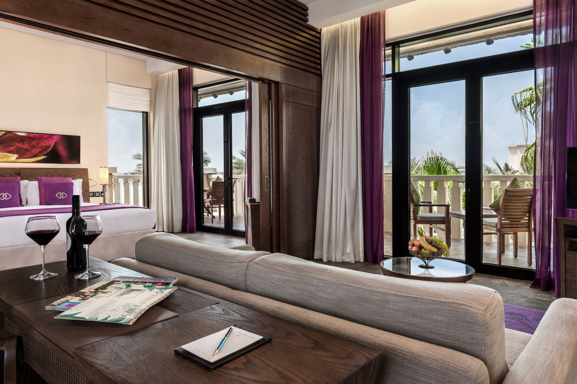
- Magazines, newspapers and books are a great addition, sometimes you can pick them up from the lobby or lounges. Placed on the bed, sofa, coffee table, shelves, next to or under the TV, on the balcony table or subbed by the pool. A good read is entertaining and adds a human presence. One tip: headings and brands printed on the magazine cover and inserts should not be readable. I suggest using books on generic thematic like cooking, travel, spa and wellness. We do not want to advertise other brands.
- Bags, shoes, scarfs, clothing, hats, sunglasses, reading glasses, makeup and perfumes are additional accessories which sometimes bring the human element too. I would add candles and scented sticks but for safety reasons some brands might not want to include these.
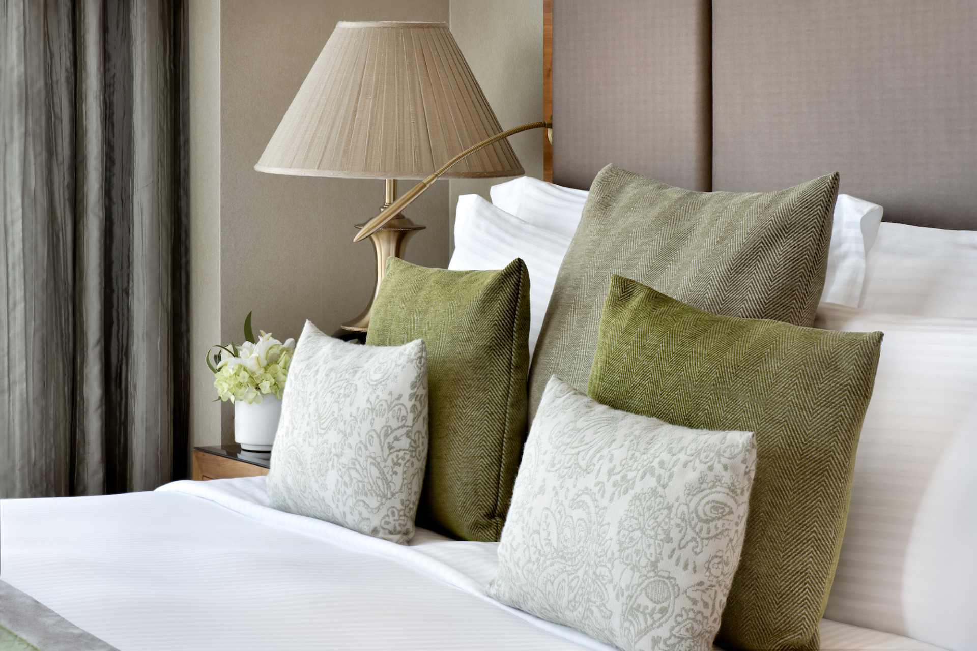
- Decorative elements, like small statues, vases, glasses, small plates, cushions make the place look cozy. They need to be styled and arranged.
- The same counts for breakfast and dinner set up, or just small bites and drinks. These aren’t that often as normally set up in large suites, apartments and villas where a dining room, living room, kitchen, balconies and swimming pool(s) are featured.
- Tip: let some air and water flow. Open doors and let the wind in (when there is a balcony). Let the tub open in the bathtub or kitchen sink. Why not add bubbles in the tub too. And for special occasions some rose petals would make the interior very romantic – in the bathtub and bed. Towel art is out of fashion and usually will only include if required for special set up.
Use whatever would look good, but do not overcrowd the area. It should not look messy. Keep in mind where the main focus is. Normally botanicals and books / magazines would be sufficient. Again, do not add things that do not belong there or does not fit the interior and the brand.
As for the food, I think the best way to add life into the shot is introducing a motion. When we talk about food, we should consider its classification – fine dining, semi-casual and casual. Each category would dictate how creative we can go when styling the food. You can do a lot with a “hand model”.
Besides the person holding a glass, spoon, fork, knife or chopsticks, more popular options include poring, seeding, seasoning, shredding, squeezing, stirring, shaking, scooping or throwing in the air… be creative. If hands are visible, they should be presentable, especially nails. Sometimes the presentation is what makes the food interesting.
If hand model is not an option, steam, smoke, food being cut or torn apart, sliced, bites (use spoon not to leave teeth marks), droplets, or broken pieces of food around the main dish. Splashes and flying food are even more creative. Food photography is a large topic on its own that opens up for different discussions like props, styling and the creative side of it, therefore, will save this discussion for another time.
Until then, stay inspired.
Ioanna
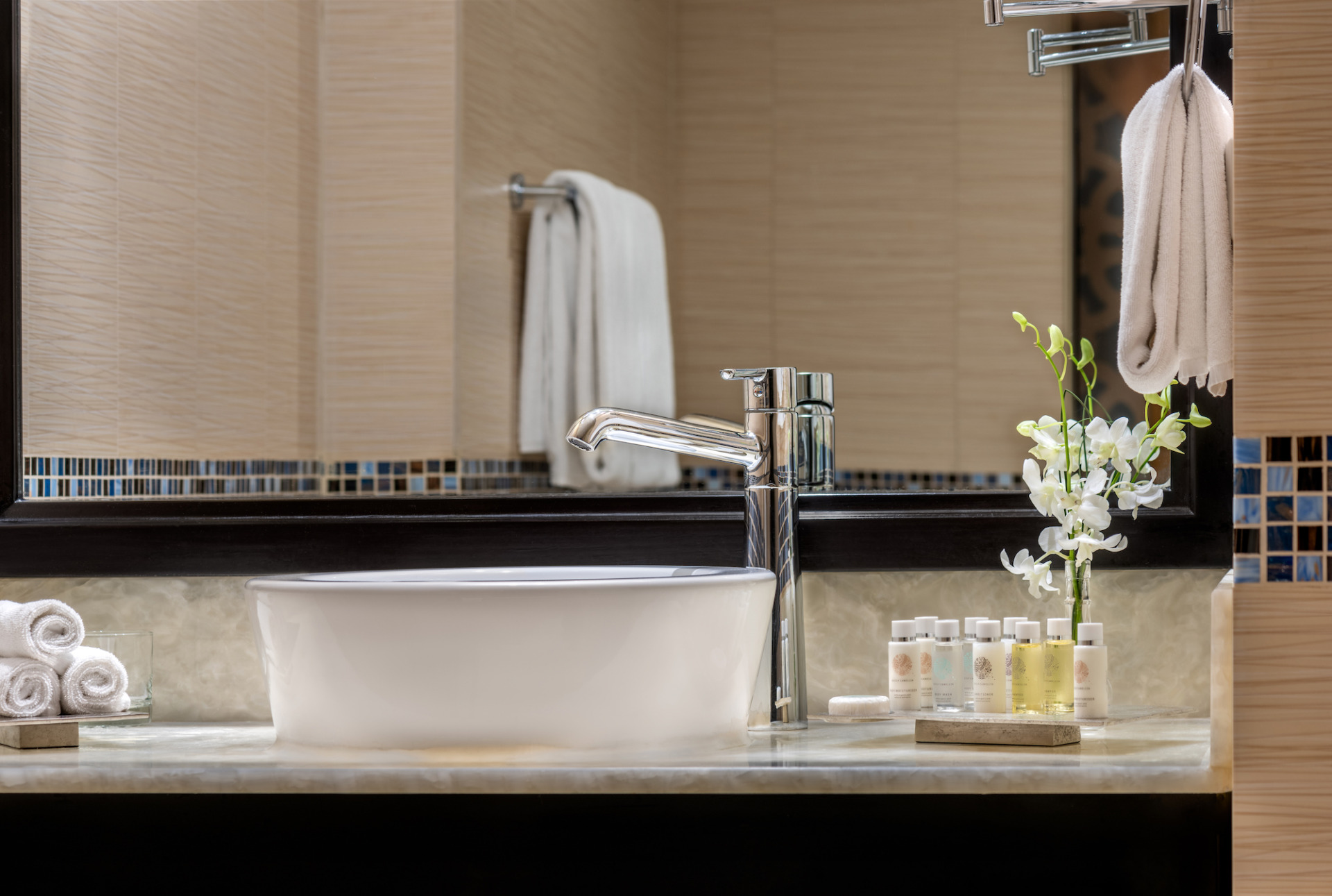
Now let’s get onto the actual clean up for the perfect picture
February 5, 2023
There is so much more that goes behind in the cleaning process. Who does not like smooth like a cloud bed that makes you jump on it? For an image to look beautiful does not have to be spotless. Here is something to keep in mind… final image should appear natural and as realistic as possible. Little crease here and there is acceptable, it is normal to be there. Nevertheless, this would depend on the individual guidelines as some brands consider keeping the creases and even A/C units while others require these to be removed completely.
Does it distract? I ask myself this question all the time throughout the image until it is final and this is valid for exterior, interior, food, lifestyle you name it. And again, if something can be cleaned up prior the photoshoot, it will definitely save you time later.
There are small, often minute objects that aren’t noticeable to the normal eye, but to me they cause obstruction like a hair, cloth string, spots, lens dust spots, scratches. Besides, harsh shadows and highlights (spot light, hot lights) can also distract. What is considered as harsh? When the line between dark and bright areas is well-defined, the area itself is darker or brighter and no detail can be seen. Unless this is an artistic expression or aims for a fine art appearance, removing them would make the image look flat. This would not look natural because the light always shapes the objects, and with that you can see where the light was. I personally prefer softer shadows and highlights. The line looks blurry and the area is dark or bright enough to notice the detail below. My style is about softening the edges and brightening the shadows (darkening the highlight) a bit until you see the detail. It will please the viewer’s eye and will allow enjoying the naturally beautiful image as it should. Check out the Before and After below and for more samples, visit How we work page.
One additional tip: it is recommended to zoom at 100% during retouching (I use Lightroom and Photoshop CC) but often I find myself “walking on the ceiling and walls” and “crawling the floor” at 300%-400% for more precise editing. Here is the thing, be patient as this could be very time-consuming. Once the retouching is complete, zoom out at around 33% – 50%, enough to see the entire frame on the screen and have a final look at the whole picture. If something bothers you, maybe it should not be there or needs a slight correction so the final image would look just perfect.
How can you make an image look welcoming and lively? That’s the next topic to discuss.
Until then, stay inspired.
Ioanna
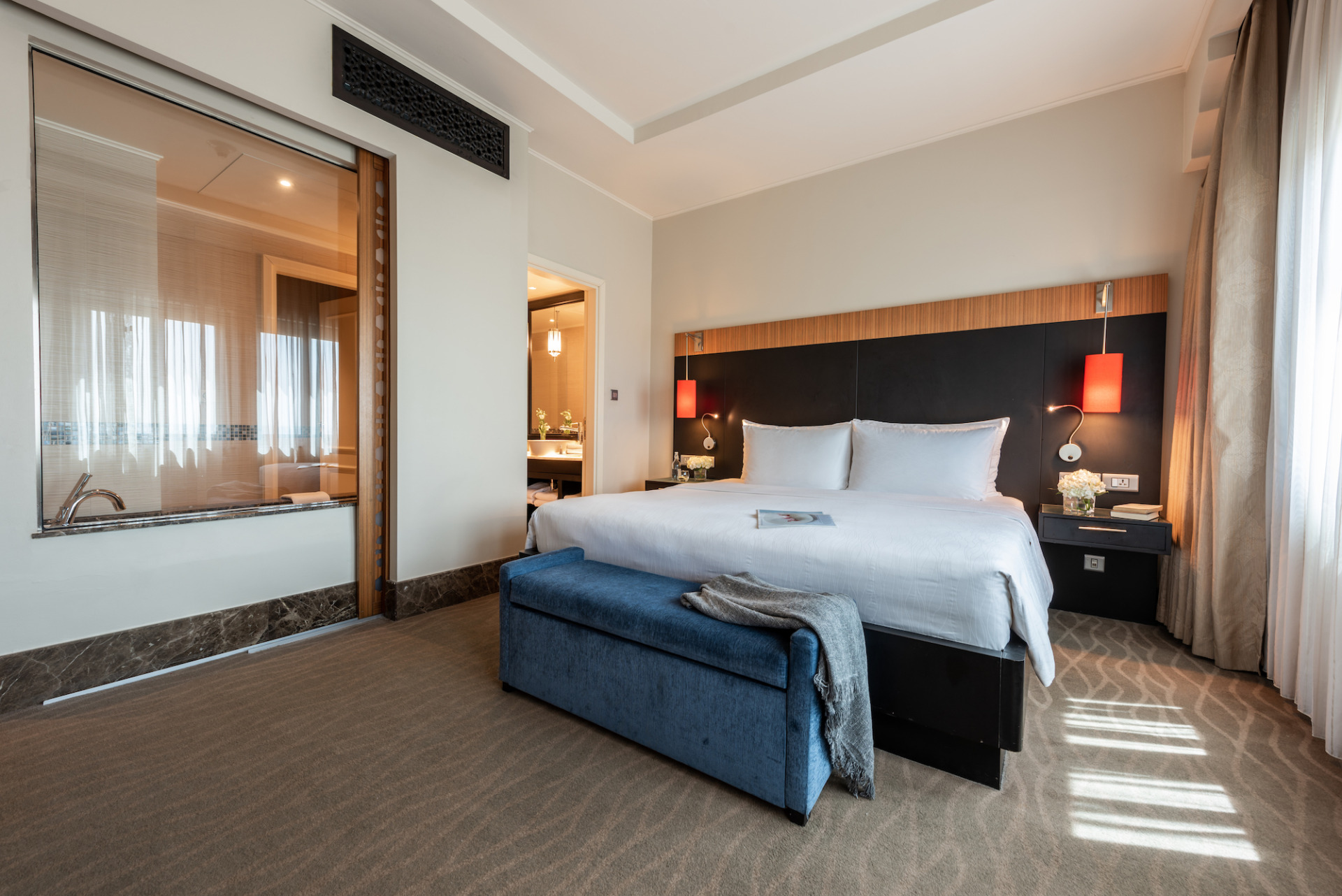
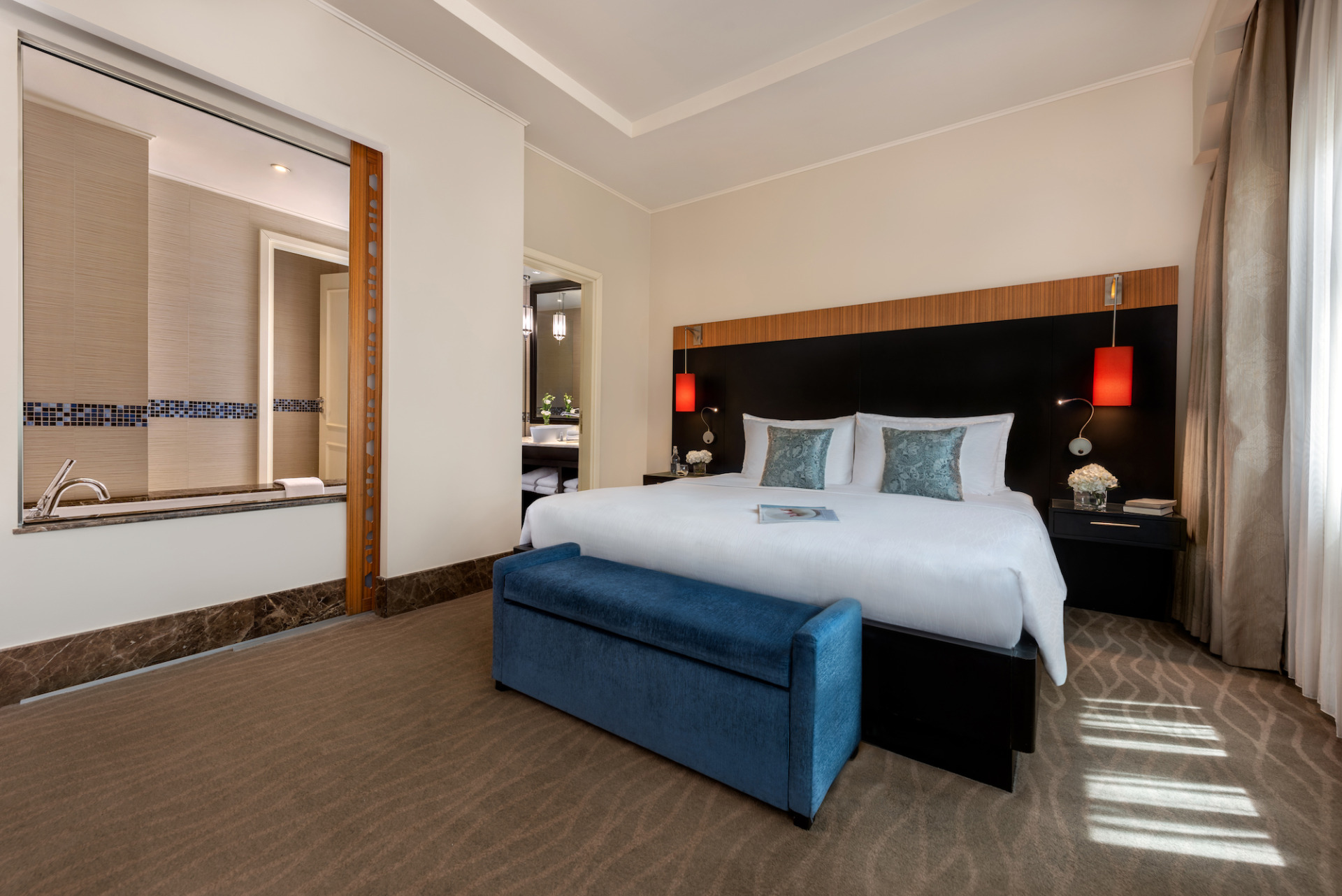
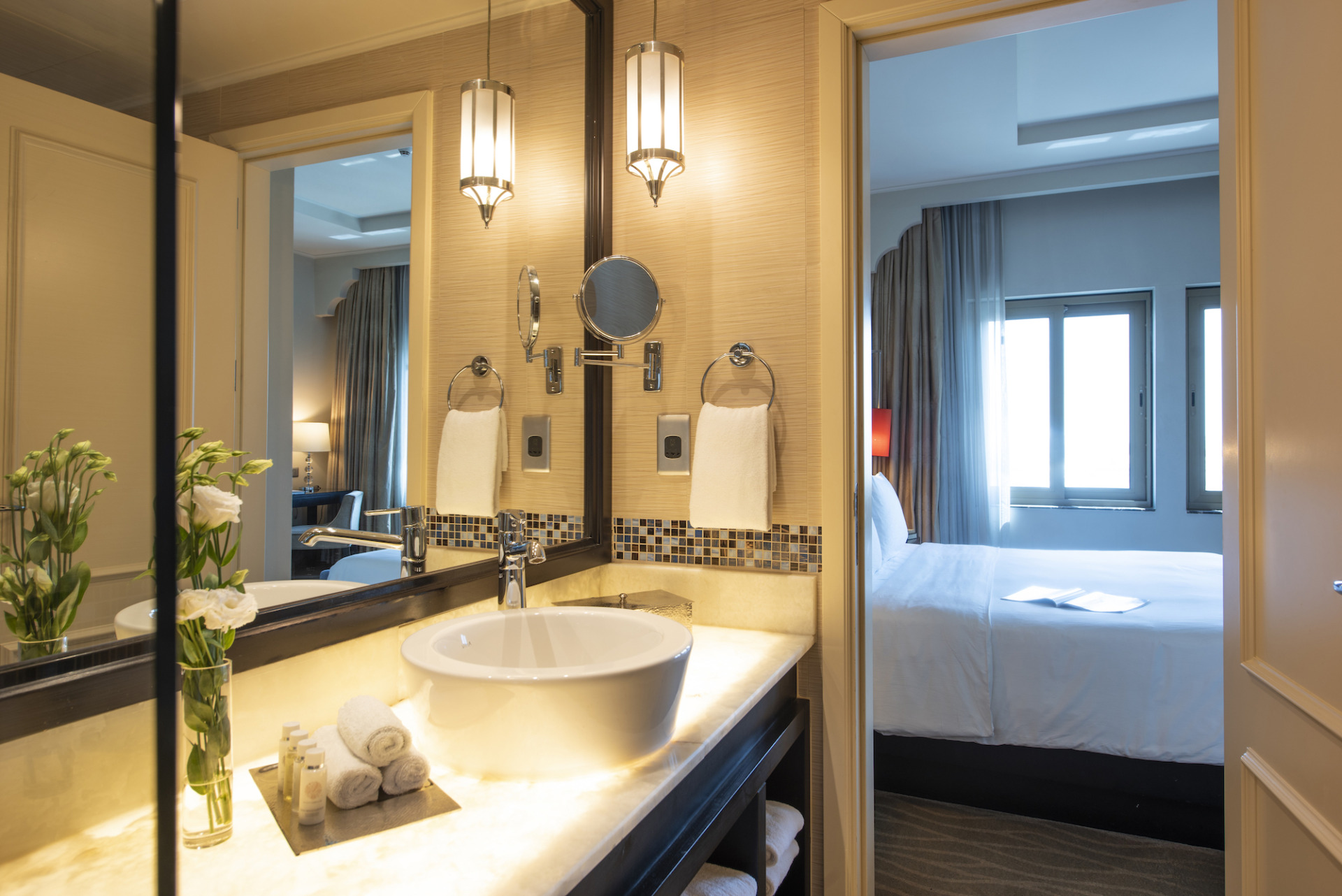
Let’s do some clean up
January 29, 2023
I thought to get on straight with the lengthy process of post-production, but I think there is something that leads to it before we reach for it which is somehow will make your life much easier as a retoucher. And that is preplanning.
Have you seen beautiful mesmerising hotels and resorts that you just wish to be able to explore? With social media and travel websites that is not a problem. As photographers, we want them not just to experience but to be able to create these images for you to see. Sadly, this is not always the case. Whether is a brand-new location or 10-20 years old hotels with not so good shape, each one presents its challenges. You might already know this, but time is of an essence during photoshoots. Although there is steam around including housekeeping and the engineering (chefs for food photoshoots), still there are things that could not be fixed or cleaned in addition to fixtures that are permanent and cannot be taken out during photoshoot.
When it comes to removal of objects, brands have different requirements. We all know that common items like A/C vents, electrical sockets, ceiling openings, caps, cameras, trash bins, tissue boxes, smoke detectors, cables and signage (including any fire, health and safety related) are compulsory by authorities, but unless required to be highlighted as a special feature, they are usually removed in post-production. I called such items “internal” as they do not contribute to the guest experience and do not please but rather the opposite. Marketing collateral and TV screens present data that is generally for a limited time and for the duration the image is used, they are more likely to be outdated which is why they are removed from all areas that are about to be photographed. Since brands have their own requirements, you might consider what needs to be “removed” and that includes the TV screens – in the past, the hotel logo or image could be displayed, but more common is to be black or gradient.
The whole purpose of the retouching is to have a clean image that guides the viewer directly to the key features. That includes cleaning up of cracks, marks, spots and dust on walls, floor, ceiling and furniture. In food that would be scratches and spots on the table and plate and spilled sauces. Food would look so much more appetising when those distractions are cleaned up. It’s important for the image to be inviting, welcoming, and indulging; even if that means adding human elements to “bring live into the scene” in times when models are not present… a topic for another time. However, do not add things that do not belong there, or change colours or objects. The current trends are to keep the image as realistic as possible, yet pleasant and appealing.
Usually a location scout (also known as recce visit) helps the photographer to see the property and identify the best light, view and angle in addition to any problematic areas prior the photoshoot date. The Studio page contains a list with our recommendations to make the preparation easier.
Stay with me until next time to go deeper in the retouching phase.
Ioanna
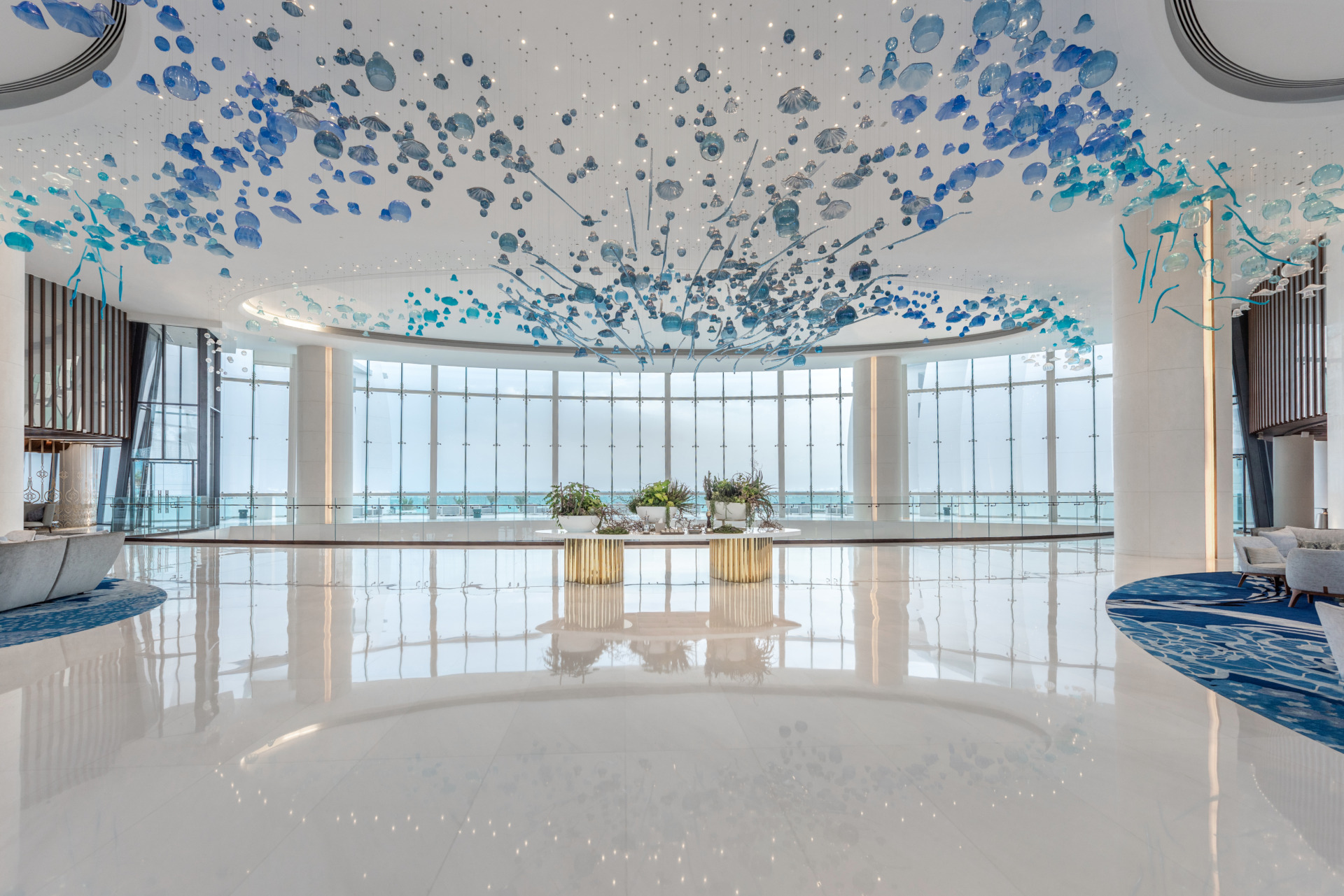
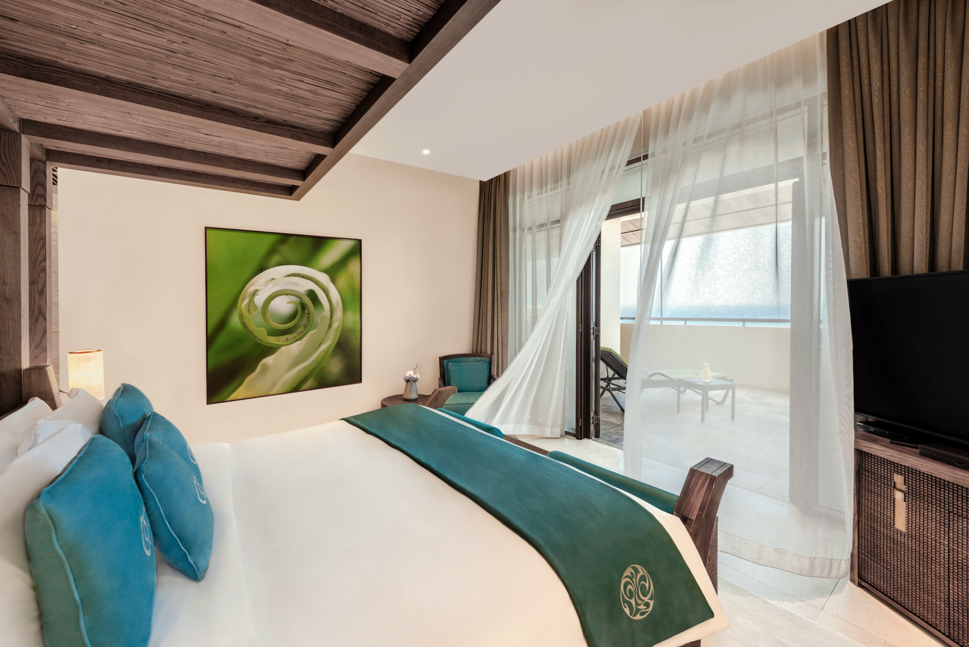
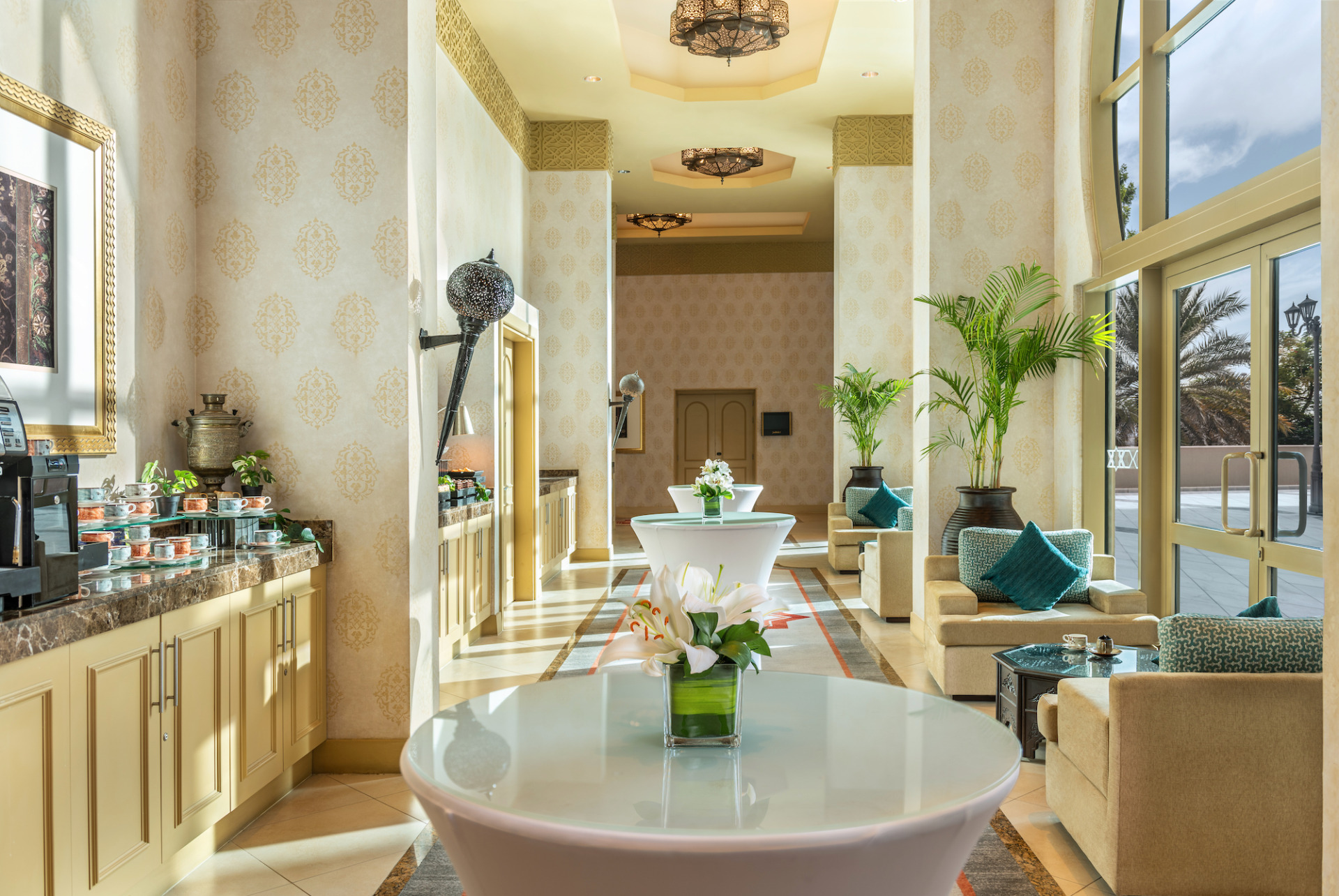
Photography is more than just ‘taking pretty pictures’. It’s an art that often is underestimated. Don’t you agree?
January 15, 2023
I will start today with a saying by Margot Fonteyn, “Great artists are people who find the way to be themselves in their art”.
Although this is a quote by a ballet dancer, it is very relevant to any art including photography. With every picture, the creator is an artist who depicts his own personal characteristics, style and vision. An image says what words cannot, but it communicates what the photographer as an original creator sees or wants you to see. Those who know me would often hear me say “the way I see this”. This is because the image exists in my head and through the camera I would be able to show it so others can see it too. Whether I am creating a photo for a personal project or for a client, the final image is more than just a beautiful visual description of the object / subject, it’s an interpretation of my personality, vision and style, therefore is unique.
If you have noticed, I use create photo and not take a photo. Wondering what’s the difference? When talking about taking a photo, I feel that for many people photography is all about good camera and the process is easy, simple and could be done by anyone. You don’t have to ask for a photo, you take it. Far from the truth, photography starts before pressing the shutter. For a photo to be made, it takes time, effort, knowledge, tools, skills, planning, and patience too. Just like mixing ingredients to prepare favourite dish. Well, food is also an art… I know chefs would agree with me.
As I already mentioned, the artist’s creativity and personal vision come first in visualisation of the image in the brain and when all pieces are arranged together, the only thing that is left is to document that puzzle with a camera. Now, why “documented”? Photographs become evidence, historic records that prove the existence of things and people. Past, present and even future can be seen though images. Isn’t it fascinating? While that’s another topic, we are not done just yet as this is only the first phase of creation.
The second stage is the post production also known as retouching or editing and this process is as crucial as the actual photoshoot. If not done correctly, it will ruin the picture. And no artist wants to create and display something that is not worthy of showing. Just think of the number of pages being smashed and thrown away by an author until it’s perfect. Stay tuned until next time when I will talk about retouching.
Until next time, Ioanna
Welcome to my Blog
January 1, 2023
Happy New Year and thank you for being here which would mean we share one thing in common… photography. New year, new blog and all posts are based on my personal experience and knowledge, and I hope to be rather helpful and not to bore you.
But first, let me tell you about me. No, I am not going to write a CV and you can go to The Studio page… I would like to extend my warm welcome to you and invite you to get to know me.
To start, I have always been connected to art in some way. I entered into the photography at an early age but it took a long ride till I eventually get back on that road. My first encounter in the photo-making world was in the dark room under red light stirring chemicals with my uncle so we could see the black and white family and friends faces looking back at us, thanks to not so fancy Zenit and Konika analogue camera (upgraded later to Yashika). Considered as the ‘old school’ now, but at that age (around 9 or 10) little did I know that 20 years later I will be continuing this journey for real. I have also begun to paint and would use all tubes on one paperboard as canvas and even gave as a gift one large painting with the mountains seen from our house to my mom’s friend visiting from Ukraine. At one point I felt passionate about ballet dancing and for 2 years did dancing classes and stepped on a stage for the first time, it remains my biggest childhood unfulfilled dream and I admire still. As a teenager, I was swept away from the fashion world, drawing sketches of gowns and female outfits (I still have them) with the desire to one day work for Versace. This interest kept me going because years later I actually enrolled in Masters in Photography hoping to learn more about fashion photography. Do you see the connection? In more recent years I have added another artistic direction in my journey. Entering the marketing field, designing graphic creatives where I learnt how media and hospitality work. Above all, in my spare time (oh I wish I had more of it) I love to do architectural designs, which has its strong influence over my photography genre and personal projects. Surrounded by different types of art for so many years I have no regrets. Funny enough, it runs in the family. The studies helped me learn about “behind the scene” in photography, the history and invention, discovering great practitioners, and exploring photography career opportunities that led me to the professional level where I am today. Funny enough, being back at my photography journey after so long, I remember photographing items that should not look good. Strange isn’t it since photography is about things looking pretty.
No, photography is more than “taking pretty pictures”. And if you stick with me, you will know how.
Until next time, Yoanna


